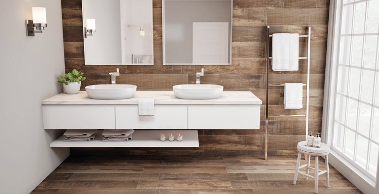
Mercado Forest color Ipirapuera porcelain wood planks
Antique Oak is an incredibly attractive floor option available for your home. Well known for its durability and longevity, this material has a beautiful open grain which gives it more character than other wood-look tile choices. Rather than being produced from hardwood, this wood-look tile is composed of porcelain tile. The printing process of this tile is so advanced, many individuals cannot tell the difference between the tile and wood. Since the porcelain tile uses no wood, it is the “greener” flooring option.
Consider the size
When choosing wall and decor color for a room with Antique Oak consider its size first. In a small space, warm colors can make your space feel even smaller but cool colors can make your space feel larger. Warm colors are red, orange and yellow and cooler colors are green, violet and blue. Warm colors are also best used in rooms where activities take place. Cool colors are calming and tend to work best in bedrooms to promote healthy sleep patterns.
Target impression
Another way to approach your color scheme is through what impression you would like the room to give visitors when they enter. If you want the colors to pop and make a statement, using complementary colors will accomplish that. If you want the room’s appearance to be more understated, your best bet is to use an analogous color scheme.
Identify the color scheme
You can see the relationship between colors through the utilization of a standard 12-part color wheel. In what is called Color Theory, three colors that sit right next to one another are considered to be analogous, while colors that are opposite one another on the wheel are complementary. Since analogous colors are more subtle in variation, they can easily blend with one another while complementary colors stand out when placed side by side. While Antique Oak can take on a different appearance in various lighting conditions, we will explain these color schemes using the light reddish tone.
Using an analogous color scheme which includes the color of your Antique Oak flooring would be to combine that reddish color with orange and gold accents. These colors would add instant warmth to the room and give it a traditional look.
A complementary color scheme would make the room look more vibrant and provide visual interest. With Antique Oak being your base, incorporating greens and blues would strike a great balance between warm and cool colors. Be sure to use neutrals throughout the space to prevent the energy of the room from becoming too overwhelming. It is always good to give the eye a place to pause when looking at a more dynamic color scheme.
See a wide range of porcelain wood planks by visiting a Conestoga Tile showroom near you.